Saturday 19 April 2014

Question 7

Looking back at your preliminary task, what do you feel you have learnt in the progression from it to the full product?

(please use full screen)

Friday 18 April 2014

Question 6

What have you learnt about technologies from the process of constructing this product?


Thursday 17 April 2014

Question 5

How did you attract/address your audience?


(please use full screen)

Sunday 13 April 2014

Question 4

Who would be the audience for your media product?

(please use full screen)

Friday 11 April 2014

Question 3

What kind of media institution might distribute your media product and why?

As Bauer is the publisher of Q, this is why I would choose it as the publisher of my music magazine, as I already applied quite a few of Q's layout and techniques to attract my target audience.


Despite this, I would also choose Bauer as it is they are a division of the largest, privately owned publishing group in Europe, which has grown to become a global media empire, owning 80 brands and 230 magazine in 15 different countries. Through this, I consider my magazine's association with this publisher to be beneficial as it would grow through their success and global recognition.

Bauer has demonstrated their power in the media industry through the acquisition of Emap in 2008 and all the brands and platforms it entails, gaining Bauer Media in the process.

Bauer Media also publicises other platforms, such as magazines and radio mainly. This would support my magazine in using these platforms to advertise the magazine brand and gain popularity.

As well as this, since the most recognisable magazines are published by Bauer and their success has generally grown since their establishment, it is difficult to perceive any other publisher as being more beneficial to a highly positive outcome.

It could be fair to say that this is partially a result of their dedicated focus to connecting with their target audience. This can be done through the layout, images (the models and representation), language and platforms such as the internet and television (Bauer's 'Box Television'). This appeals to the technophiles of the media's audience, that is growing more everyday through technology's greater influence over our daily lives, especially the lives of the younger generation. From this, Bauer has introduced technological platforms for it's most successful brands as a way of maintaining it's appeal to it's target audience, who generally tend to be the teen/young adults. This is why I made sure to include the aspect of the online site of my brand 'AMPlified' within my magazine, which was www.amplified.co.uk, as I too share this target audience age.


Bauer's brands are distributed by Frontline, which was formed by Emap in 1986 to handle their demands of an expanding circulation, yet now distributes Bauer Media, since Bauer's aforementioned acquisition of Emap. However, Bauer was already involved with Frontline since 2005.

Front line has also acquired many other partners, such as Haymarket and BBC, since it was created, making the company bigger. Overall Frontline distributes 160 magazines, and from this, is the most successful distributor in the UK. It's main job is to maximise the sales in the most cost effective way and use sophisticated software that ensures the right magazines and the right amount of copies are getting to the right shops.

Therefore, I would use Frontline as the distributor for my brand, not only as it distribute Bauer which owns Q which I used a considerable amount in analysing techniques for my own production, but also as it's success would hopefully raise of my magazine.

The only possible negative of Frontline, is that it is under threat of going bust as less and less people want magazines on paper because of the increase in popularity of technology and the competition of free magazines, such as fanzines like The Fly, who may force big brands to downgrade their magazines to become free and exist off advertisers. This means that publishers will not need a distribution company, meaning that the jobs of the employees of Frontline are in danger. However, the elderly audience generally still prefer the old fashioned paper copies, suggesting that this may still allow the paper copies of magazines to continue to be sold for a while longer which will keep the distributors in business in the meantime. Although, this is true for all distributors of magazines, therefore Frontline is still the best to choose, as as a result of it's higher success, it may mean that it may sustain itself longer than other less popular distributors.

Supply Chain


Wednesday 9 April 2014

Question 2

How does the Media Production represent a particular social group?

The aim of my music magazine product was to appeal to a certain social group, specifically 16 to 25 year old males. I feel my product achieved this is a number of different ways.
I designed my magazine in the style of Q Magazine, with my individual interpretation, as we both share the genre of rock/indie. Therefore, I thought it to be wise to take into account Q's mode of address, to attract my target audience.


I also mostly modelled my cover on this issue of Q as I felt it was not over-detailed and refreshing in it's simplicity, unlike magazines such as Kerrang!, which are presented with quite a cluttered layout. I chose this as it conveyed a relaxed atmosphere and a professional look, appearing well-thought out and specific. It was this I thought would attract my target audience as it appears inviting and eye-catching. Instead of the mass of information and complicated layout of Kerrang!, which I felt would overwhelm the audience.


I eventually chose this image to be displayed as the main image for my cover page.
The model of the photographs is a female within my target audience age range. As shown through my research, my target audience do favour a singular female artist. I have also used similar clothing and make-up to other models from other same genre magazines (eg, Q, NME), this is in keeping with the audience's preferences, and also ties with my aimed colour scheme (approved in my research) of red, black, yellow and white. This all relates the artist to the audience and their social group, conveying that the magazine understands them, which creates the trust that will ensure further sales from that individual.

The model portrays the representation of my target audience's social group, while also expressing the desire to aspire in life through her facial expressions; to feel free to self express themselves in their preferences; to be original in a society they do not necessarily feel they fit. I choose this representation as it is considered the stereotypical concern of my teenage/young adult social group, that they have difficulty finding their purpose for the rest of their life. A phase where they have left the restriction of childhood and are embracing the responsibility of the adult world as well as their individuality as a person.

This all relates the artist to the audience and their social group, conveying that the magazine understands them, which creates the trust that will ensure further sales from that individual.

In the article the best representational aspects can be seen from again the images, but also the textual content. For example, the image portrays vulnerability. I chose this image as her eye contact between herself and the audience, relating to the storyline, but also creating empathy and the suggestion that the model links to that individual and understands them, which is what the magazine I have created, is trying to convey.

In keeping with the layout of other articles, I made certain that I included details such as credits like words and portrait, drop caps, pull quotes, an image of the artist, the colour scheme of the magazine, the date of the issue, conventional language 'exclusively', page numbers that match the contents page (pages 21 and 22) and subscription and website details to appeal to the technophiles and to portray that this brand has multi-media platforms. This all presents the magazine as professional and realistic and appeals to my target social group.

The contents page represents the social group through its images again, similar to above, such as the rock/indie style of the clothing the artist wears. I have also kept the same model for the cover page, contents page, and article, to portrays how this magazine links together (and also helps the audience to make the connection between these pieces of content), how they would realistically focus on a main artist per issue, and how they would manage time and cost by using images from the same shoot.
I also used different genders to represent the specified male gender of my target audience, to relate them to the magazine.
As well as this, choosing a more seductive pose for the female artist in my contents page, plays to attracting the male audience that the magazine targets, which could also generate more sales, and by extension, profit for the brand.

Like my article, my contents page uses words and phrases, for example 'exclusive' and 'revealed' to entice the audience to delve deeper into the magazine's contents, appealing to my specific target audience by detailing artists that connect to the genre of the magazine and their age range, 'Arctic Monkeys'.

Sunday 6 April 2014

Question 1

In what ways does your media product use, develop or challenge forms and conventions of real media products?

(please use full screen)

Front Cover Contents Page Double Page Spread Article

Friday 4 April 2014

Finished Contents Page


This is my final draft of my music magazine contents page.
I moved the 'REVIEWS' title and  also added 'FEATURES' and 'EVERY MONTH' in bold size 14 font. I used red page numbers and grey under text in size 12 to be large enough for the audience to read. This all corresponds to the colour scheme of my magazine as red, black, white and grey.

In addition to this, I modified my initial plan of the arrangement of my review contents as the grey text underneath some lines took up a larger space than expected. I therefore had to switch 'IN THE STUDIO' and 'REISSUES', with 'LIVES' and 'DIGITAL'. However, I did manage to change the page numbers so that my magazine still had the amount of pages on each piece of content that I had intended, eg, two page on reissues. I considered this neccessary to modify, as I viewed amounts of pages magazines I had originally chosen to be realistic of a real magazine.

Friday 28 March 2014

Contents Page InDesign Draft: 4

I have added the page number to the contents page (2) as it would realistically be at the front of the magazine. I have also added numbers to the pictures to correspond to the pages they apply to and the contents in the contents page.

I have also added lined up text within the review section of my contents page, however, there possitions may alter as more informative text needs to be added as planned.

I made the 'EVERY MONTH' title thinner and moved the text slightly to the left. Following this, I also moved the title 'CONTENTS' to the left as well, as I felt its spread out presentation gave the page an amateur look.

Tuesday 25 March 2014

Contents Page InDesign Draft: 3


I changed my original drawn draft idea of three images as the my secondary female model's pose was at an angle that did not work well in my layout; her legs were not horizontal to the camera, meaning that the image did not fit proportionally in the size of the box I had intended. Unfortunately I could not alter the size of the box to avoid disfiguring the image, as it would take up a considerable amount of room and compromise the rest of my layout, leaving little room for my content.

For this reason, I cut her place in my contents page out, amending my InDesign production two containing two images. I had already included a picture of a female and a male, with varied camera shots, which meant that her absence would not prove fatal for my production. I also now have more room to fit in the review section of my contents, which may prove valuable as it contains quite an amount of text, and I need to make sure that this text is big enough to be read with ease for my audience. I wrote the review title in white Bernard MT Condensed font on a black box as planned to stand out as a title without distracting too much.

In addition to this, I added 'FEATURE' and 'EVERY MONTH' in the style of Q to reflect my colour scheme and attract my similar target audience to Q magazine. I also spaced the red boxes that these two texts are upon, away from the separation lines, as I felt it contributed to a more professional presentation and worked well with the layout.


Sunday 23 March 2014

Contents Page InDesign Draft: 2


In this stage in my draft, I decided to change my original idea of my contents page (shown in my drawn draft) by adding a grey box between the title and the rest of the page. This separates the title (which I slimmed into a more thin line) from the top of my contents page, which through research of magazines like Q with a similar genre, I have found to be a technique often used. This will present my magazine as professional and realistic.


Following this, I then added a grey background behind my image with the aid of photoshopping my image, which I have previously detailed in an earlier blog post, and using the clipping path and feathering tool to blend into the grey box I placed behind the image on another layer. I also added lines on the page, which I had previously intended, to separate my various contents sections and images subtly.

Friday 21 March 2014

Contents Page InDesign Draft: 1

This is the first draft in the production of my music magazine contents page. I attempted to recreate the 'AMPlified' masthead I used for my cover page and article. This is evident in many magazines as they reinforce their brand to remind the audience of who brought them this entertainment and information.

I also created the title with white text upon a black box to differentiate from the masthead, as planned, without distracting the audience's attention. Beside the title I placed the issue date and web address for efficiency and to clarify the issue and its association with the content. The web address is to appeal to the technophiles who are my target audience of the male young adult age range. This may maintain their interest in the brand as technology moves forward and may also attract a wider audience through the internet as another platform to advertise the brand.

Wednesday 19 March 2014

Image selection for Contents Page

These are the initial photo graphs for my music magazine contents page. The models in the photographs reflect my target audience of male young adults. I chose to do this as it is a technique I have researched to be effective in professional magazines as it suggests that the magazine understands the audience, which creates a trusting bond that regular purchases will follow, creating profit for the magazine.


I used an image of my artist 'Ella' as it is a reoccurring mention within my magazine, as real magazines often repeat references to their main piece to make certain their audience has noticed. Plus, it might interest other, therefore creating a wider audience. In my previous planning, I have created a photo planning document for this model's collection of images, which this photo was extracted from. I also chose this pose as it is similar to artist Florence Welch's pose for Q magazine, which has a similar genre (rock/indie) and demographic to mine.


I also decided on using other models of the young adult age range in my contents page, to show the diversity of the audience's interests and present my brand as realistic as it covers a wide range of artists. I conveyed this through having different genders shown. However, I maintained the idea of appealing to my target audience when considering their poses by presenting the male as standing (common in other magazine's images of a single male) with an eyeline match with the audience to suggest a connection between the audience and the magazine. This is similar to the secondary female model, who also is conveying an eyeline match with the audience, although, her pose is more seductive, reflecting an interest of a male target audience. This makes the magazine more appealing which will also generate sales. Both sets of clothing also represent the rebellious life-style that is generally associated with this age range and genre of magazine, reflecting the audience's preferences to convey the magazine as trustworthy and befriend the individual reader.

Magazine Photo Shoot Planning Document


 Use the following document to plan each of the photographs on the cover, contents page and double page spread of your music magazine.

This document plans the two secondary images (the male and the female) that I intend to be used in my contents page. The image containing my main artist 'Ella', is from a collection of images I have created a planning document about during an earlier stage in my development of my music magazine, specifically when planning my cover page image.

Shoot date and time
      10/01/13 evening


Image Description


A selection images to represent my target audience and their interests. The in-depth detail of my reasoning is presented in the above text, along side the specific images.


Shoot Location


I shot the images in a university corridor as it was convenient, I wasn't dependent on daylight and I didn't plan on needing the background for my magazine.
Model / person contact Details
These two models are friends of my sister and within the age range of my target audience, which is what I wanted. 


Permission Details


     Yes, my models gave full permission for my images to be taken and used.
       
Props

    I used the wall as the back ground for my images, however, it is not intended to be used. I also used the costume that my models are wearing to reflect the interests of my target audience, and the persona they might want to be perceived as, creating the view that they and the magazine are similar and share a trusting bond.


Plan of shots


Previously mentioned in depth above.

The male's stance, eyeline match and costume presents him as similar to my target audience of a male young adult, possibly representing them. 

The female also uses this to present her connection to the rock/indie genre and style. However, her pose suggests seduction which is used by brands to appeal to their target audience.


I removed the backgrounds of my images to convey a professional approach to my contents page. This helps my images to work well on my InDesign production with the use of the clipping path and feathering tool.


Monday 17 March 2014

Finished Article


I have made adjustments to the article, such as the addition of words like 'of' and 'to', the spelling correction of 'Winehouse' and changing the font of 'CONTROL' to bold, so as to allow it to stand out more on the page and catch the audience's attention.
I have included my original planned pull quotes. However, instead of having both my positive and negative pull quotes within my article. I chose to place my positive pull quote above my image, to portray the connection between the image and the text, as well as filling space. I also shortened the text I wanted to include within my pull quote to be more concise and have a more eye-catching appeal. In this modification to my initial idea, I used an ellipsis, which is evident is other magazine pull quotes as it conveys to the reader that this text is lifted from the main text.
I placed my negative pull quote between two columns to break up the formal structure slightly, making it more preferable to read with a more relaxed approach and using the intriguing of the two pull quotes to interest the audience into the text. Both of the two pull quotes' format techniques I have displayed are evident on many magazine brands, which I have spotted and recreated to portray a realistic music magazine. Although, it could be considered that the break up of the structure of text with a pull quote is actually a representation of my artist 'Ella', who's live is presented as being unstructured and broken with her struggle.

Saturday 15 March 2014

Article InDesign Draft: 4


I have added in the article text by transferring my written article from my documents as a Microsoft Word draft to my InDesign double-page spread through Adobe Bridge. I then highlighted my first letter of my opening paragraph 'W' and made it into a drop caps, which sits against five lines of text, as researched.

I also added 'AMPlified' in red to the end of my main article text, like Q magazine, for a professional presentation, with words and portrait to suggest my magazine as authentic. However, the text of my article fitted oddly, which to resolve I then had to take 'Out of' into a separate text box. This meant it could fit with the title more efficiently and prefect the layout, by allowing more room for an even spacing of the text. The care in the organisation of of the layout is key in suggesting how the article hasn't been just thrown together with little thought. In fact, it presents the brand 'AMPlified' as caring about the audience, a great deal of time and thought has gone into the presentation of the magazine and it's content for the reader's pleasure. This creates a bond between the audience and the brand, as the audience feels the magazine is interested in, and shares, their likes and dislikes, leading to a trusting relationship which generates profit for the magazine.

As well as this, I modified my article by changing the opening paragraph's text to capital letters, which was not intended during my initial draft. However, I decided it was necessary as it emphasizes the separation of this text from the rest of the main text, giving it a more professional look to the layout.

Tuesday 11 March 2014

Article InDesign Draft: 3


I have lightened the background, using the transparency tool, to achieve the shade of grey I originally wanted.

The title of my article was constructed with 'CONTROL' enlarged like planned in my drafts but in italic font to further emphasize it's distinction from the rest of the text.

I made the sell line of the article underneath the title for the portrayal of a professional format of a real article. I also enlarged the sell line's text to size 20 because I didn't want it to blend with the article content too much, however, not so much as to draw attention from the the article's title and the additional pull quotes I have planned to include at a later date in further progress. I emphasized 'Ella' in red because it is the artist my magazine article is conveying, and my magazine would want to advertise her as much as possible. This also helps the magazine in turn, as her fame will attract readers, which will gain profit for the magazine and the chain of businesses that will benefit. This could be, for example, a publisher like Bauer which has over eighty influential media brands like Q or Grazia, the shops that sell the magazines, or the distributor like Frontline.

I have added my page numbers to the bottom of my double page spread, which correspond to my contents page. I felt this important for the authenticity of my magazine as realistic and professional. This includes their simplistic presentation, using the colour scheme, to also suggest uniformity within the magazine.

I kept my web address and subscription information plain and simple to avoid over-complicating, following the reoccurring layout I have found within other successful magazine brands. This is evident in Q magazine which keeps their layout simple but effective, so I decided I should too as we share a the same target audience specification. This is also true for the reason behind including this information. My magazine aims to target within the young adult age range which are considered to be technophiles. This is why the addition of technology aspects for the brand may help the magazine to maintain interest with it's audience and perhaps reach a wider audience through this relatively new platform.

With the portrait details, I had originally thought to have them at the bottom left hand side of my image, as similar to other magazine layouts. However, I found that I had to change the text from the right-hand side to the left-hand side, to be seen clearly, as the text didn't present it self well in any colour on top of the model's clothing  in the left-hand corner of my image.

Thursday 6 March 2014

Article InDesign Draft: 2


I have added the mast head and date to the article. The date expresses how this content is exclusive to this issue, presenting the magazine as immediate, fresh and current with information.

I tried to recreate my cover page's masthead, as keeping the masthead the same is good branding of the magazine. This is shown through magazines like Q, who repeatedly emphasize their brand across their content within the magazine, not just on the cover.

I also felt that the back ground colour did not portray the colour grey that I had intended, therefore, I adjusted the colour and shading to achieve a colour that was closer to what I desired to produce.

Tuesday 4 March 2014

Article InDesign Draft: 1

This is the initial progress I have made on my article. I have already produced a detailed drawn draft of my layout and colour scheme, as well as previously creating the written article text I will include, plus highlighting my pull quotes. Therefore, the next step is to transfer my draft from paper to InDesign and modifying any errors I may have made unintentionally.


I have slightly changed my design in the sense that I originally portrayed a white background, however, I felt it conveyed and amateur approach to the making of the magazine. This is why I took the decision to create two object boxes  on top of the pages and colour them a slight grey, to maintain the colour scheme and to not  overwhelm the audience with a colour that makes it difficult for them to read and appreciate the rest of the content.

The image's pose represents vulnerability, which suggests the audience to sympathise with her. Her direct eyeline emphasizes this as it engages with the attention of the audience and stimulates empathy towards the artist is conveys (Ella). The reason this proves effective, as research of other magazines sharing these techniques suggest, is that it connects the audience with the magazine, expressing the feeling that the individual reader has a understanding bond with the magazine.

I also feathered the image's outline, so as to present a professional approach, but also that the image interlinks with the other content of the article, suggesting that the magazine is a single body and that thought and meaning has gone in to it's production.

Friday 28 February 2014

Main Image for My Article

This is the photo I selected out of the other photographs of my model from the my cover page image photo shoot.


I chose this image as her eye contact between herself and the audience, creates empathy and the suggestion that the model links to that individual and understands them, which is what the magazine I have created, is trying to convey.

I then attempted to Photoshop my image, so that the background was removed to create the professional presentation of an image in a magazine. I attempted to have as smooth outline of the image as possible, however this proved to be very time-consuming and difficult. Therefore, I decided to make a smooth line to the best of my ability and use the basic feather tool when transferred onto my InDesign double page spread.


Wednesday 26 February 2014

Written Article

This is my written article that I will include in my double-page spread. I used my model from my cover page image, as I felt it had put the most emphasis on it. Plus, I have already taken my photographs of the model which is time efficient.

My title, headline and introduction is displayed on my initial draft of my article. I decided to have a conversational article as, through research, in my opinion it proved to be the most manageable to produce whilst still maintaining a professional style.

In my written draft, I have also underlined the text I considered appropriate to be my pull quotes within my article.

The AMPlified Interview

What inspired you to pursue music?
Well, I suppose I have always found music a comfort, especially in my teenage years. I was going through a rough patch and there was something about it that just, well, made me think.

Talking of a rough patch, how do you think you are coping with the fame your music has brought you?
(Chuckles) I knew this was going to come up. I’m not going to deny that I was out of control for a while. I was going through a really bad phase in my life. I know everyone says it, but when I started out, I really was just in it for the music. I never dreamt this would happen, and it all just took me by surprise. I experimented with drinking and drugs because for a moment, reality just ran away with me. I went from being a nobody to a somebody in the blink of an eye and I guess I got lost along the way.

What do you reckon was the point where you realised you had to change?
One morning I saw myself on the cover of a magazine. Let’s just say, I didn’t look my best. They must have caught me off guard, and when I saw myself I was shocked! Yeah! I was embarrassed, and a bit annoyed at myself for letting myself get this way. The fact it was a random picture, where I hadn’t made a special effort, meant I couldn’t deny that was really what I had become, and I didn’t like it!

So what did you decide to do to turn your life around?
(Sighs) It took longer than I thought but I knew I had to do something. My close friends and family have all been very supportive in helping me regain my image and kick the drugs. If I am honest, I will still probably drink. I’m not going to lie and say I will never again, because we all know I will. I’m just aiming to do it in moderation.

Has fame surprised you then?
Without a doubt. Suddenly everyone was asking me things and following me around. I definitely wasn’t prepared then. I can really understand how artists sometime find it hard now.

So, with that in mind, do you reckon you have matured since you first began your music career?
Definitely. When I first started out, I was given a chance to explore a life I couldn’t imagine myself ever achieving, but after a while, I understood the consequences of how harsh this new life could be and it definitely gave me a wakeup call. I thought I knew it all. Funny to think it was a only a few years ago. I was a rebellious teen who thought the world was against me. I had just been given a taste of adult life and, I think the fame just added to it. I wanted have my name known for what I believed. I still reckon the only way I can properly communicate this is through my music.

Your unique approach to music could definitely be considered a reason why your audience enjoys listening to it. Do you reckon there is a relationship between this and their young adult age?
I think that they have probably experienced how I felt, either in or just out of that awkward stage of deciding how to make your mark on the world. This could be how they get the message my music gives. Hopefully, my fans can connect with the messages in my music.

You say that this is reason that you hope your fans admire you, do you admire anyone?
Well, as I have said, my music is a big part of my life, and so growing up, I admired many music artists that I felt understood me, like Kasabian. But now, hmm... I reckon I admire artists like Amy Whinehouse, because, although my experience hasn’t been as extreme as hers, I can empathise with how she had changed.

We heard about your spat with Lily Allen over Twitter. Have you resolved this?
Oh yeah, uh, I would say we are very similar in our style, and sometimes this can clash. I don’t have anything against her personally but we are just two people who I doubt will ever get on.

Will you be applying any of your recent struggles to your new album, out January 2015?
I would expect so. It has been such a big part of my life, with so many feelings, I reckon they will end up in a song eventually as I find it quite therapeutic, and perhaps others in a similar position can relate.

That’s a good point. What would you say to someone who was in your position?
I’m not sure I can answer that. All I know is that my family and friends helped me through the worst of it, and I don’t know if I could have done it without their support. So, I would strongly suggest that this person surrounds themselves with encouragement, because it's so much harder alone.

Saturday 22 February 2014

Finished Cover Page

This is my final draft of my cover page, finished and completed.

I added the pug from my drawn draft last, as I felt the other features of the page were more of a priority. However, I did follow through in including a pug, as I felt it strengthened the grid structure and gave it a more professional appearance. I had initially intended the colour of the pug to be red, yet, when I constructed it on my InDesign piece, I felt it drew too much attention away from the masthead, as there was far too much red. This is why I changed it to a subtle colour like grey, which slightly blends with the radial gradient grey background I made, yet still distinct enough to be separate.

Within the pug, the band 'OASIS' to change my original intention of the colour grey, to white with an outline, as a result of the previous modification of the pug's colours. This was essential as the word wouldn't be visible if left unchanged. Then I decided that the band name would possibly attract in fans, and this chance would be increased with the name was emphasized. This is why I changed the letters to capitol and increased the size.

I also added in a barcode, to appear genuine and realistic as a professional magazine. I attempted to make the barcode a size that would be typical of magazine to display. Through research, I have noticed the rotation  of the barcode and placement of the price in various positions on a cover page. However, I found the most common and simplistic was on the side of the barcode where I placed my price, and I changed the rotation to vertical rather than horizontal. I chose the simplistic approach as Q is know for it's clear and well structured presentation, and I didn't want to ruin my replication of this with clutter. Also, I included an American price, as it present my brand as a magazine that national, and portrays popularity that might generate sales, as the audience might consider the magazine as successful if it is available in other countries, especially America, who is known for it's media coverage.

Finally, I decided to added 'BRIT AWARD WINNERS' to the Arctic Monkeys sell line, as it is from real life, and not artificially created by myself, which presents the magazine as real.

Thursday 20 February 2014

Cover Page InDesign Draft: 5

With my fifth draft, I added the sell lines of the cover. I made sure that all the sell lines were on the left-hand side of the cover page and relatively in line with one another. This presents a clear grid structure which conveys professionalism, as it is what magazines, such as Q, ensure to portray, unlike Kerrang! which tends to convey a less well structured presentation.

To appear authentic, I individually modified every sell line. This helps to bring lines closer together, position well and to stand out from each other subtly. From my original drawn draft, I have changed the font of 'inside' to italic, for slight emphasis, but also I changed the colour of 'RATED' from grey to red, as I felt the grey didn't highlight the word enough.

Wednesday 19 February 2014

Cover Page InDesign Draft: 4

With the pull quote, I chose to keep the majority of the sentence lower case, as it looked more visually effective and realistic as speech. However, I kept 'CONTROL' in capitol letters because it was the specific part of the quote that would pull the audience in, which is why I thought it necessary to emphasize this with large capital letters and a slight slant.

The explanation of the splash colour was changed from grey to white with a thick black outline, for the sole reason that the text wasn't easy to read against my model's outfit. This is why I chose the same colour scheme as the splash, but change the ratio of outline against the letters, so this it would distinguish the two pieces of text as different, but linked in the shared colours.

Monday 17 February 2014

Cover Page InDesign Draft: 3

This is the further construction of my front page.
I have added the header bar, enlarging my text and slanting 'BIGGEST' for the dramatic effect of emphasis.
The my reason behind only choosing one header bar, instead of accompanying this with a footer, was as a result of research into the layout of Q magazines, which is a brand that shares my idealistic target audience and Rock/Indie music genre. My research showed that Q front cover never presented both a footer and a header bar, which I took into account in designing, choosing the most common layout of just a header bar. This way, I can ensure my design is an accurate representation of a real magazine front cover, as it shares details that a professional magazine would entail. This element of research is something I found useful when designing my contents page and article layouts.

I have also progressed to the stage of constructing my splash for my main image. The name 'ELLA' was chosen for it's few syllables, making it memorable and easily pronounced, like other female solo artists such as Adele and Madonna. I outlined the text in black to ensure it stood out, as it was the splash and so, one of the most important pieces of text to be presented on the cover. I changed the font to bold arial. The kept the colours of the splash from my drafts the same as I felt they contrasted with each other well enough to stand out, but also not so much as to repel the audience from reading. As well as this, the colours tied in with the colour scheme of red, black, white and grey, and the outfit that also corresponds and may relate to the target audience's style preference. This represents the magazine as having uniformity and professionalism as this has been though out, as opposed to random colours been thrown on to the page.

I moved the masthead across from the draft's originally assigned position, which I then outlined the box of the text to give it a move professional appearance. I used the additional space I created between the masthead and the left-hand edge of the page to present the date of the issue in an outlined box, which isn't apparent on the draft. I felt the date of the issue was necessary to include as it one of the key distinguishing details of a magazine, and without it, or without it properly presented, the magazine I create would not be authentic. The font I used was bold minion pro with the size of 10.

Sunday 16 February 2014

Cover Page InDesign Draft: 2


This is my further development on my music magazine.
I decided to shorten the length of my masthead box and also dramatise the text by vertically lengthening it slightly and using a bold outline (darker on the section I previously emphasized 'AMP', to maintain this).
I also lowered by mast head to allow room for a header bar at a later date in the development, to contribute to the grid structure.

Sunday 2 February 2014

Cover Page InDesign Draft: 1

This is my first draft of my rock/indie music magazine cover page.

I position my cover page image in the right hand side of my cover page (using layers) to create the grid structure for my sell lines and other various features like a pug or a splash.

I then created a grey background with an edit of a radial gradient to present a professional approach and maintain the general colour scheme; complimentary to the primary colours. Upon this, I used the feathering tool to blend the image in with the background around the edges, enphasizing this approach.

After which, I decided to construct my initial development of my mast head. I used the color scheme's bold colour of red to allow the mast head to stand out from the rest of the cover page, as the mast head is what is considered most important; promotion the brand and what audiences will use to reference the magazine. Therefore, it is imperative that this is remembered, albeit in a professional manner. I chose the box shape to compliment the rectangular shape of the cover page and the grid structure I will introduce at a later stage; I felt it is important for a audience to feel a sense of connectivity and linking within the magazine, as if the layout and style were to creative, it might present the magazine as disjointed and not visually appealing.

The play on the word 'AMP' in 'AMPlified' is empahsized through a bolder text to emphasize it's intentional significance. The colour of white for the text was chosen to contrast to the red, I felt this was effective as the audience will be drawn in to read the masthead, and by extension, the rest of the magazine. This colour scheme and text font is shown effective through 'Q's example.

Music Magazine: Drawn Drafts

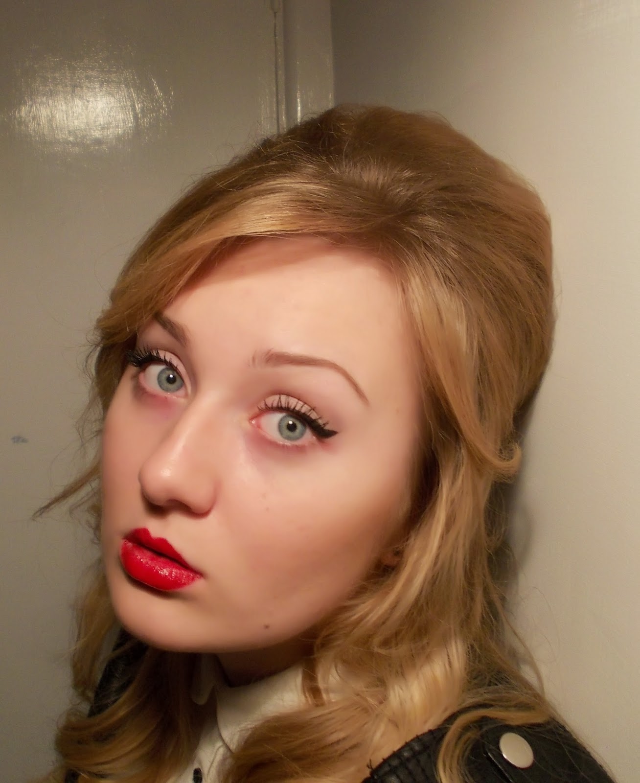
This is my initial ideas for the front cover of my Rock/Indie music magazine.


I based my splash on colour, size, font and spacing of letters from this issue of 'Q' as it is the magazine brand I am basing my cover page on. This is because 'Q's genre is similar to mine, and so, I thought it wise to adopt techniques it conveys, to present a magazine that would appeal to my target audience.


I also modeled my header bar on this issue of 'Q' as I felt it was not over-detailed and refreshing in it's simplicity. In addition to the grid structure, I decided to only display a header bar, opposed to displaying both a header bar and a footer line, based on research of 'Q's layout. This is evident in the image below.


The masthead colour and layout is also modeled on 'Q'. I replicated this in a similar way as it stands out from the rest of the text on the cover page (the unique colour combination of white on red). However I added outlining for emphasis.

This is my contents page for my music magazine, that I have designed.


I decided to model my contents page of a genuine magazine of a similar genre to mine (rock/indie) to create a music magazine that would be perceived as realistic and professional. This is why I chose Q magazine. The layout and style techniques were easy to use to mold my own idea of a music magazine contents page.


I used all of my cover page sell lines within the features of my draft, as having the pages linking would present the magazine I create as authentic.


Following this, I kept the colour scheme the same as my cover page, and gave the largest picture frame to the model of my splash, as this is what I intend to focus my article on. This portrays this feature of my magazine as important.


I kept my page numbers below 50, which is what my target audience research suggested, as well as my frequency of publishing 'the best tracks this week'. This presents how I have taken my research into account and actively applied my magazine in such a way that would appeal to my target audience. This is imperative in the success of a magazine, as being attractive for the audience will generate interest, that will then lead to sales which will produce profit for the brand, publisher, and any symbiotic relationships the magazine shares with advertisements within the magazine. Plus the more sales, the higher advertisers and artists will be willing to pay to be positively displayed within the magazine, further increasing profit.

On the subject on advertisers, the page numbers I displayed suggest the amount of pages used for that feature. However, for some of the amounts of 3 pages, this will entail a page used for an advertisement. Although, advertisements are not specified within the contents page as research shows that this is not what other magazines tend to present.


With the models I have used, I decided that it would be representative of what my target audience would individually prefer, if I presented both genders. This way, I can portray a female, which my target audience may find desirably appealing, as well as the male artists that will relate to their gender. This does not single out a gender, and will hopefully cover all preferences of this genre. Also, it presents the brand as high in knowledge of all aspects of it's genre.

I chose to use different positions for the models to pose in, as this portrays the magazine as professional and different in the sense that it does not always stick to the repetitive and sometimes boring details. Instead, it conveys it's self as unique, and, for my target audience who may be at that stage in their lives where they are considering what they was to do with their future, it represents the individuality they might be craving to express. Therefore, by being a creative outlet, the target audience may find comfort in being consumer of the magazine, which will generate profit for the brand. As well as this, another reason for choosing a more seductive pose for the female artist in my contents page, is that it plays to attracting the male audience that the magazine targets, which could also generate more sales, and by extension, profit.


This is my drawn draft of the article I aim to produce for my music magazine.


I already had a rough idea of how I wanted my article to be presented like. However, I researched various other professional magazines to assist is perfecting my idea to allow it to be at a stage that would be considered a realistic article for a magazine.
I used layout suggestions from:


I used style and colour scheme suggestions from:


I choose to call the interview 'THE AMPLIFIED INTERVIEW' to reinforce who gave the the reader the article.


Like Q magazine, I ended my article with my brand name, and to further reinforce the origin of the content. This is evident in the Adam Ant article from Q magazine, shown above.


I used the quotation 'out of CONTROL' as my title because I felt that because this was probably what brought the audience to the article in the magazine, and so I wanted to make it clear that this was it's content.


In keeping with the layout of other articles, I made certain that I included details such as credits like words and portrait, drop caps, pull quotes, an image of the artist, the colour scheme of the magazine, the date of the issue, conventional language 'exclusively', page numbers that match the contents page (pages 21 and 22) and subscription and website details to appeal to the technophiles and to portray that this brand has multi-media platforms. This all presents the magazine as professional and realistic.